

Overview
With the complexities of life, getting together has become complicated and burdensome. HangKick is a social planning app that streamlines the activity planning process to facilitate social connection and increased engagement. It makes the planning experience intuitive and fun.
Role
User research
Ideation
Visual design
Prototyping
Testing
Tools
Figma
Miro
Mural
Photoshop
Platform
Mobile
(Note: as a prototype not all features function)

“We live in the most technologically connected age in the history of civilization, yet rates of loneliness have doubled since the 1980s“
-Vivek H. Murthy, Former US Surgeon General
Overview
Rethinking How We Connect
The Problem:
We live in a highly connected society, but suffer from decision fatigue, complex schedules, and loneliness despite having so much at our fingertips. HangKick is a social planning app that streamlines the activity planning process to facilitate social connection and increase engagement. It makes the planning experience intuitive and fun. My design challenge was to re envision a social app while reducing decision fatigue and removing the burden of planning from the user.
The Solution:
Before creating a solution, I needed to confront and understand the problem. I went through the design thinking methodology: empathize, define, ideate, prototype, and test to best understand my users and their needs. I determined that people have complex needs, but simple end goals. So I designed a mobile app to streamline the process of finding and scheduling activities, focusing on user needs and ease of use.
Design Process
What Did I do?
My role was to undertake the whole project from concept to creation and everything in between. I worked extensively on research, evaluation, design, and iteration. In the figure below you can see The Design Thinking Model used and work implemented.
Empathize
Understanding The Problem & The Competition
Surveys & Interviews
The goal at this point in my research was to avoid conceiving any ideas, but to let the user inform me on what the real issues are and what the best solution could be. After surveying over 20 individuals and conducting 7 user interviews, users expressed many wants and wishes for how to improve planning. I also gained a greater understanding of what their current processes are and that these individuals felt overwhelmed.
“How can I take the burden of planning from the user?”
To address the question above I needed to further explore what functionality would truly benefit the user, but also what solutions currently exist in the market.
Heuristic Analysis
Next step? Determine the current app landscape. I researched 3 apps due to popularity and overlap with the HangKick market. I looked at eventbrite, the nudge, and planmesh all apps that try to tackle aspects of this problem space. I found that they were all very specialized and didn’t have a lot of overlap.
Define
How Can We Create a Complete Experience?
My role was to undertake the whole project from concept to creation and everything in between. I worked extensively on research, evaluation, design, and iteration. In the figure below you can see The Design Thinking Model used and work implemented.
Thematic Analysis
After I transcribed all of my user interviews, I carefully marked them up with a select number of codes. I limited my codes to best encompass the key user desires and needs without too much granularity. I went through three rounds of mapping to see what themes were bubbling up across all the data. For each mapping I worked to see if I could see anything differently.
(Click Maps to View in Detail)


Key Findings
Users were looking for something to do.
Users want someone else to plan or share responsibility.
Desire for sharing availability in a streamlined/no fuss manner.
Need for visualizing availability.
Users want easy and simple ways to communicate.
Users desire responsiveness.
Desire for reminders, backup plans, centralized information, advanced planning, considerations for location and expenses.
Users want insights from others through social media, polling/group consensus, or reviews.
Increased interactivity with others leads to greater ease in further connection and a sense of closeness.
Desire for companionship versus desire for individual activities.
Uncontrollable issues included: weather, Covid, kids, being overwhelmed, or illness were less plan-able for the participants.
Empathy Mapping
Next I mapped out my findings into an empathy map to further externalize and visualize my knowledge of the user. This solidified my understanding of the user and their thought process.
Key Pain Points:
“I can’t think of anything to do”
“Will this activity be too much work to plan?”
“I don’t know when my friend is available”
“Why can’t my friend message me back sooner?”
Key Gain Points:
Spend more time with friends
Feeling closer to her current friends
Easier to do things with friends
Have more fun
Personas
Overall, my users are over 20. They use or have used at least one social app which indicates their desire and motivation for connection. They have a desire for help with ideas for planning social engagements. And they also have a desire for increased engagement.
To delve deeper in understanding my users I built out two personas based on the personalities and experiences that unfolded from my surveys and interviews. I primarily had two groups, individuals who tended to plan activities and those who did not.
The Planners’ Primary Pain:
Struggled with feeling burdened by the responsibility of keeping track of details and making sure their friends were responsive.
The Non Planners’ Primary Pain:
Tended to be overwhelmed by indecision on what activities to do at all.
User Stories
Through writing user stories, I determined the functionality necessary to meet the minimum viable product and the functionality that should wait till the next release.
As a user, I want to be able to…
Minimum Viable Product
An app that streamlines the activity planning process through assisting in activity selection, scheduling, and planning.
Browse activities by different criteria
Get suggestions for activities
View availability for self and friends
View details of selected and scheduled activity
Track scheduled activities
Get and send reminders
Cancel activities & reschedule activities
Add Friends
Find consensus with friends
Ideate
Let’s Find The Solution
Defining How Might We’s & Brainstorming
How might we help users find activities tailored to different individuals/groups?
How might we increase responsiveness between users when planning?
How might we help users find shared times to connect across their busy schedules?
How might we reduce the complexities of planning to allow for lower effort by users?
How might we help users tackle plans falling through?
User Flows
In order to visualize the steps that the user would need to follow in order to complete their epics, I created two main user flows.
Route 1 (New User): Explore and find potential activities.
Route 2 (Return User): Invite a friend to do an activity together.
Because I included multiple functionalities in the app, these flows have multiple branches to encompass the different paths that can be taken to the same end goal.
Route 1: Anne Robin (New User)
Streamlined Red Route: Wants to Explore & Find Potential Activities.
Route 2: Sarah Sims (Return User)
Streamlined Red Route: Wants to invite a friend to do an activity together.
Prototype
Look, Feel, Function
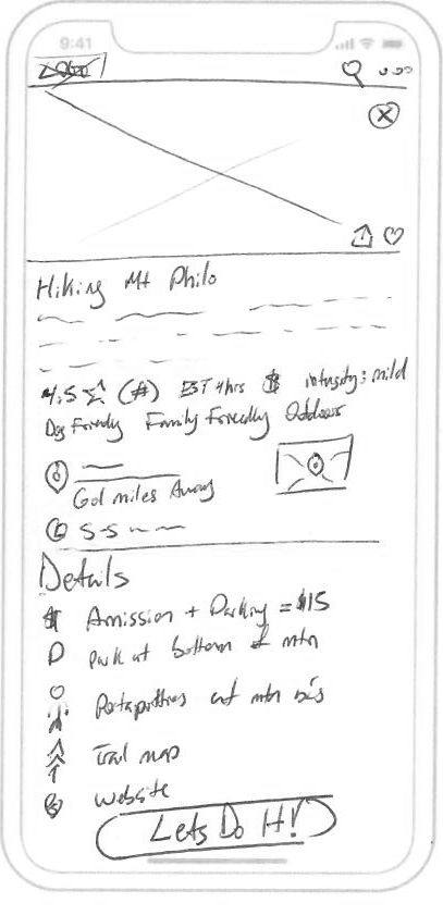
Sketches
With the user flows at the forefront of my mind, I began sketching low fidelity screens.
I spent a lot of time referencing patterns from other apps, to ensure this app would have a sense of familiarity for the user and also to consider all possible solutions to a problem. I took special consideration of the most popular streaming apps, like Netflix, Hulu, HBO Max, Prime Video, …etc. These apps do a great job of presenting their content in a simple, easy to digest, and visually appealing way, with rich categorization and search capabilities.
-
![Launch Screen]()
Launch screen
-
![Login 1]()
Login 1
-
![Login 2]()
Login 2
-
![Home]()
Home
-
![Category]()
Category
-
![Activity page]()
Activity page
-
![Schedule activity]()
Schedule activity
-
![Activity scheduled]()
Activity scheduled
-
![Search 1]()
Search 1
-
![Search 2]()
Search 2
-
![Filter]()
Filter
-
![Tracker]()
Tracker
-
![Tracker activity view]()
Tracker activity view
-
![Calendar]()
Calendar
-
![Quiz start]()
Quiz start
-
![Quiz question]()
Quiz question
-
![Quiz complete]()
Quiz complete
-
![Quiz results]()
Quiz results
-
![Profile]()
Profile
-
![Friend profile]()
Friend profile
-
![Add friends]()
Add friends
-
![Friends search]()
Friends search


Initial Test
Time to Test the Initial Solution
After working through wireframing my flows and accounting for edge cases, I built out a low fidelity clickable prototype. Then proceeded with a round of guerilla usability testing, during which I tasked my participants with completing a set of tasks.
Example Task:
“You’ve made your event and it’s been a few days, now you want to check the status of the activity you just scheduled and see if anything needs to be done.”
Due to the extensive research and brainstorming prior to testing, the majority of my participants did not struggle with any of my tasks, but the testing did uncover some areas for improvement and where my flows needed further refinement.
Changes needed:
Make sure every section and detail is as clear and understandable as possible.
Create a better hierarchy of information on the activity pages and have more progressive disclosure so as not to overwhelm the user.
Make it clearer how to edit an activity.
Flesh out activities being added to the calendar section.
Eliminate the location field in the activity scheduling flow and add a notes text field to allow people to add additional information.
What Should the App Look and Feel Like?
Brand Personality
HangKick is a venture in finding your next to do. At HangKick we believe that life satisfaction comes from engaging with others and exploration. We want you to spark joy whether that’s going to brunch with your friends or trying a new hobby.
Brand Attributes
Exciting • Authentic • Friendly • Encouraging
Imagery Inspiration
• The imagery should evoke a sense of excitement and enthusiasm.
• People should feel inspired by the visuals and want to be in the moment.
UI Inspiration
• Fresh and fun. Also friendly and approachable.
• Bold colors, but simplistic interface.
High Fidelity Screens & Clickable Prototype
Time to bring all my ideas and research to reality. Here are the high fidelity screens used to create the clickable prototype.


Test
Time to Validate & Iterate
My High Fidelity testing went very smoothly. I tested with 5 participants in round 1 and 6 in round 2. Through the testing I was able to determine areas for further improvement. I am pleased that my users felt that overall my app was simple to use and intuitive.
Round 1
Usability issue: Critical
The first finding was that the main comment share button was not immediately understandable.
Usability issue: Major
There should be more time before the “tooltip” animations that indicate how to use some parts of the app.
Solution: Add additional time before the animation plays, so user notices the “tooltips”.
Usability issue: Major
I had a couple participants not sure what the title would be for in the activity form.
Usability issue: Major
Confusion about the cancel button on the planned activity page. Lacked a save button.
Round 2
Usability issue: Critical
The “Tracker” terminology was not clear.
Usability issue: Major
I had two participants mention the search placement and not seeing it immediately.
Solution: I had one participant note that they stopped reading the menu after the profile. I also went back and looked at patterns from major apps. From these findings I determined that the search placement should be more central in the menu. There is also now a nice symmetry in the calendar and planner being adjacent to the search.
Usability issue: Major
I had two participants note that they would like to start the quiz with next and not the quiz interaction, or clearer language.
Try it Out


(Note: as a prototype not all features function)
Takeaways
Successes, Reflection, & What’s Next?
I had many usability test participants exclaim that they would download and use this app if it were available in the app store. The most rewarding success though was that my participants almost consistently expressed that the app was intuitive to use and enjoyable. The extensive research and iteration appears to have successfully created a user friendly and delightful experience. Continued testing and iteration, as well as adding second launch features, would serve to improve this experience further.
Key takeaways:
I let my users tell me what the problem is and allowed continued research to define it further.
My solution came from iterating and brainstorming what I learned from my users and my research.
I didn’t “rebuild the wheel”, but let existing patterns inform my design and this paid off as I could see during my usability testing. My users' struggles were minimal and easy to resolve.
Thinking outside the box is important, but also knowing how to communicate newness to the user.
References:
1. Cashin, A. (2021, December 13). Loneliness in America: How the Pandemic Has Deepened an Epidemic of Loneliness. Making Caring Common. Retrieved February 18, 2022, from https://mcc.gse.harvard.edu/reports/loneliness-in-america